Responsive Web Design: Why Every Business Needs a Mobile-Friendly Website
Discover why responsive web design matters for modern businesses and how a mobile-friendly website can improve user experience, engagement, and online visibility.
Responsive Web Design: Why Every Business Needs a Mobile-Friendly Website
Introduction
In today's digital world, a website is one of the most important tools for any business. Customers use websites to discover products, explore services, compare options, and contact companies. However, visitors may leave a website if it is difficult to use on their mobile phones.
This is where responsive web design becomes important. A responsive website automatically adjusts its layout to fit different screen sizes, including desktops, laptops, tablets, and smartphones. It helps businesses provide a consistent and convenient browsing experience for every visitor.
In this article, we will explore what responsive web design is, why it matters, and how businesses can benefit from a mobile-friendly website.
What Is Responsive Web Design?
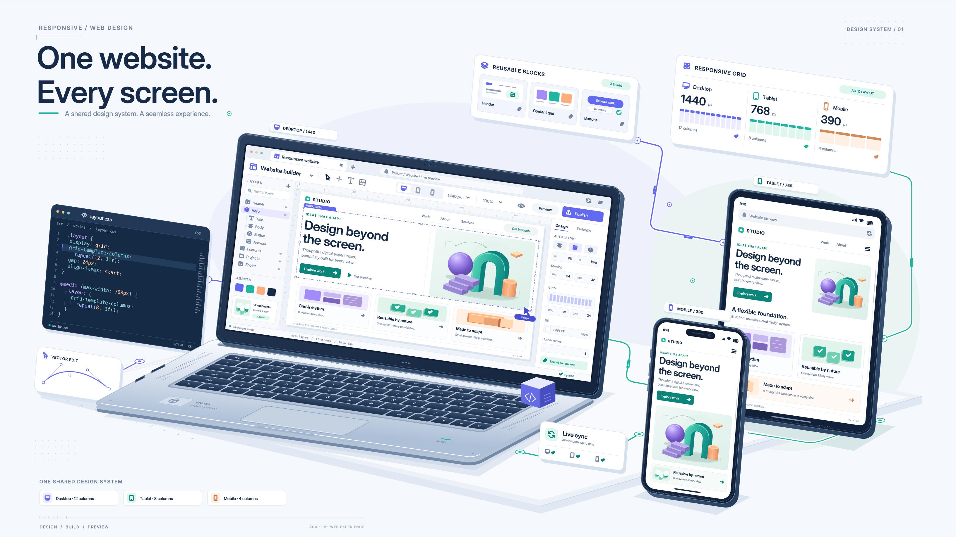
Responsive web design is an approach to website development that allows a website to adapt to different devices and screen sizes.
For example, a website viewed on a desktop may display several sections side by side. When the same website is opened on a smartphone, those sections can rearrange vertically so visitors can read the content without constantly zooming in or scrolling horizontally.
Responsive websites commonly use flexible layouts, scalable images, and CSS media queries to adjust their appearance according to the available screen space.
The goal is simple: make the website easy to access and use, regardless of the device.
Why Is a Mobile-Friendly Website Important?
1. Improves User Experience
Visitors expect websites to be easy to navigate. Small text, crowded layouts, and buttons that are difficult to tap can frustrate users.
A responsive design improves readability, organizes content clearly, and makes important information easier to find. When visitors have a better experience, they may be more likely to explore additional pages and interact with the business.
2. Supports Search Engine Visibility
A mobile-friendly website is an important part of a modern search strategy. Google primarily uses the mobile version of a website's content for indexing.
Responsive design helps businesses maintain consistent content across devices while making their websites easier to maintain. However, mobile responsiveness alone does not guarantee higher search rankings; useful content, technical quality, and relevance also matter.
3. Reaches More Potential Customers
Customers may discover a business while travelling, shopping, or searching for services from their smartphones.
A responsive website allows these visitors to browse products, read service details, view images, and contact the business without needing a desktop computer.
This helps businesses serve customers across different devices and situations.
4. Encourages Customer Enquiries
A business website should make it easy for visitors to take action. They may want to request a quotation, book an appointment, submit an enquiry, or make a purchase.
Clear call-to-action buttons, simple forms, readable contact information, and mobile-friendly navigation can make these actions more convenient.
A good website guides visitors towards the information or service they need.
5. Reduces Website Maintenance Effort
Maintaining separate desktop and mobile websites can require additional time and effort.
With responsive web design, businesses can generally manage one website that adapts to different screen sizes. This can simplify content updates and reduce the need to maintain separate versions of the same pages.
Key Features of a Responsive Website
A well-designed responsive website should include the following features:
- Flexible layouts: Content adjusts to fit the available screen width.
- Readable typography: Text remains comfortable to read on small screens.
- Optimized images: Images fit their containers and load efficiently.
- Mobile-friendly navigation: Menus are easy to open and use.
- Accessible buttons and forms: Interactive elements are easy to select and complete.
- Consistent content: Important information remains available across devices.
- Good performance: Pages load efficiently without unnecessary delays.
Together, these features help create a smoother experience for website visitors.
Best Practices for Creating a Mobile-Friendly Website
Businesses and developers can follow these practical steps to improve their websites.
1. Start with a mobile-first approach
Consider how the website will appear on smaller screens before expanding the design for larger displays. This helps prioritize important content and essential actions.
2. Use flexible layouts
CSS Flexbox, CSS Grid, and media queries help developers create layouts that adapt to different screen sizes.
3. Optimize images
Use appropriately sized images and modern image formats where suitable. Compressing images can reduce page weight and help improve loading performance.
4. Keep navigation simple
Use clear menu labels and make important pages easy to access. Visitors should be able to find services, contact information, and other essential details without confusion.
5. Make forms easy to complete
Keep forms short where possible, use suitable input types, and provide clear instructions. Ensure fields and buttons are comfortable to use on touchscreens.
6. Test across devices
Check the website on different screen sizes and browsers. Look for overlapping content, unreadable text, horizontal scrolling, and buttons that are difficult to use.
7. Monitor website performance
Tools such as Google PageSpeed Insights can help identify performance issues and suggest improvements.
Common Responsive Web Design Mistakes to Avoid
Even a visually attractive website can create problems when it is not designed carefully.
Common mistakes include using fixed-width layouts that overflow on smaller screens, uploading unnecessarily large images, hiding important content on mobile devices, using tiny buttons, and displaying pop-ups that cover the entire screen.
Another mistake is focusing only on appearance while ignoring accessibility, loading performance, and usability.
Regular testing and feedback from real users can help identify these issues before they affect more visitors.
Frequently Asked Questions
Q1. What is the main purpose of responsive web design?
Its main purpose is to make a website adapt to different screen sizes so visitors can use it comfortably on desktops, tablets, and smartphones.
Q2. Is responsive web design important for small businesses?
Yes. It helps small businesses present their products and services professionally and makes it easier for customers to browse information from mobile devices.
Q3. Does responsive design improve SEO?
Responsive design supports mobile usability and helps maintain consistent content across devices. Search visibility also depends on content quality, relevance, technical SEO, and other factors.
Q4. How can I check whether my website is mobile-friendly?
Open your website on different devices and screen sizes. You can also use browser developer tools and Google PageSpeed Insights to identify usability and performance issues.
Conclusion
Responsive web design is no longer just an optional feature for modern business websites. It is an important part of creating an accessible, user-friendly, and professional online presence.
By using flexible layouts, optimizing images, simplifying navigation, and testing across devices, businesses can provide a better experience for their visitors. A well-planned website can also support marketing activities, customer enquiries, and long-term business growth.
At A3FusionTech, thoughtful website development and digital solutions can help businesses build a stronger online presence. Investing in a responsive website is a practical step towards meeting customer expectations in an increasingly mobile-first world.
Looking to build or improve your business website? Explore A3FusionTech's web development services to discover solutions suited to your business needs.